Curved is likely the level that has taught me the most when it comes to level design. The concept of the level revolves around a scrapped idea from the original game, the Pneumatic Diversity Vent. It allows the player to use a vacuum to move objects around. But when I experimented with it, I found that it could also be used for the gels that are used in the game. That led to this level, where one has to "curve" the flow of the gel.
I had a rather unusual approach for designing this level. Instead of first drawing things out and having a proper design I could follow when building it, I went to creating the level right away. After a single prototype, I got to work and built the level directly from the vague idea I had. It worked out quite well, but there was some iterating to be done. Most importantly, the core mechanic (curving the gel) could use some better onboarding. The level went through several iterations, and whilst it's still a bit rough around the edges, I'm quite happy with the result.
A big part of making a Portal 2 map stand out against all the other community maps is by adhering to the game's theme. I've made sure to stick with the already defined visual style and narrative to make sure gameplay and visuals go hand in hand. But, to stay unique, I have taken some slight creative liberty here and there. The final result is impressive if I say so myself, and is comparable to the base game maps.
Even though this is one of my most successful Portal 2 maps, there are some serious issues and things I overlooked during development. If I were to recreate or design a new map, here is what I would do differently:
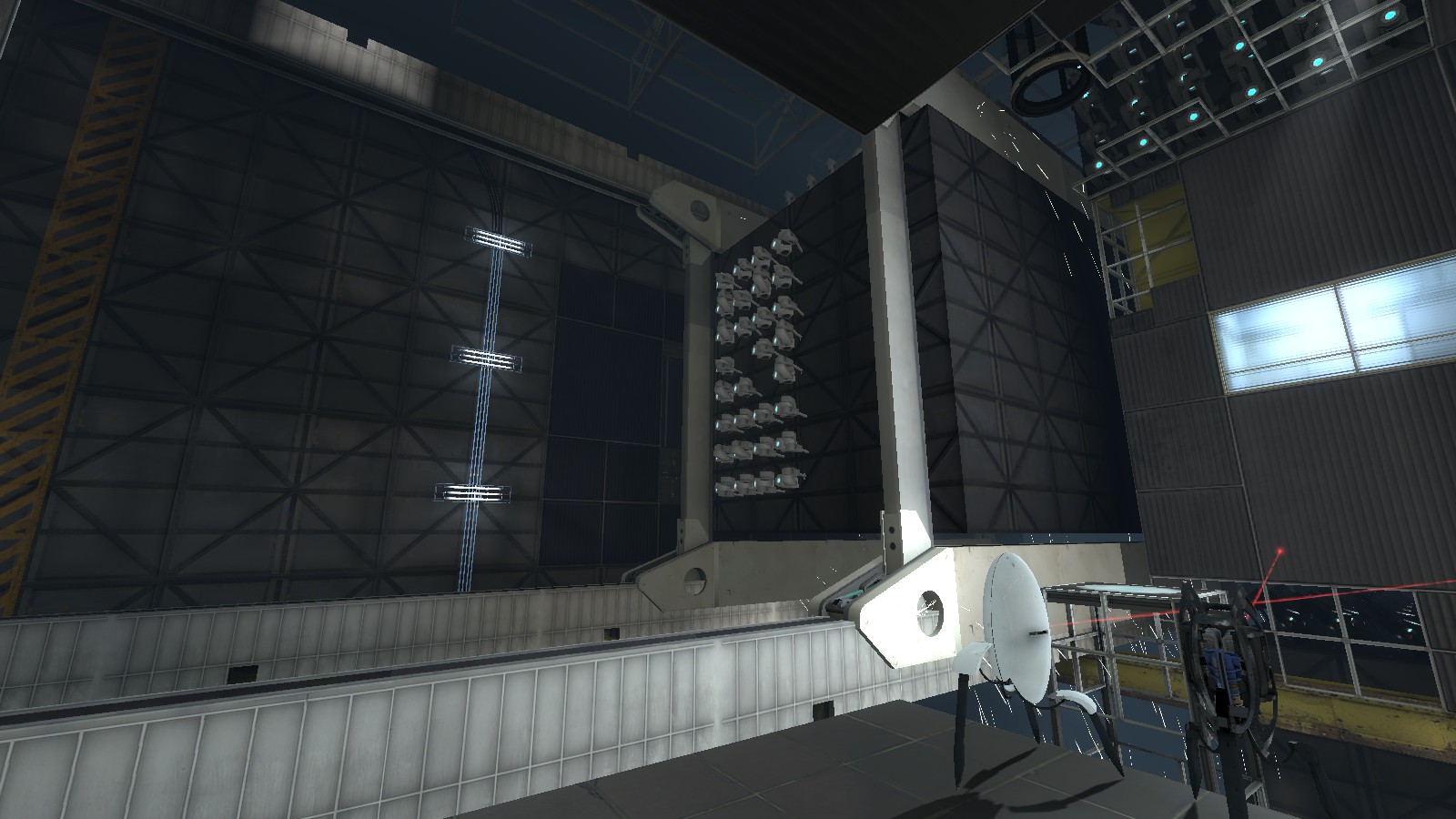
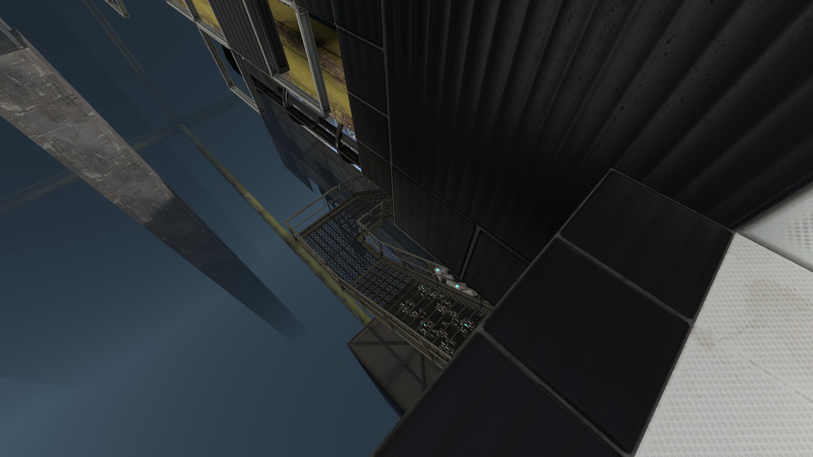
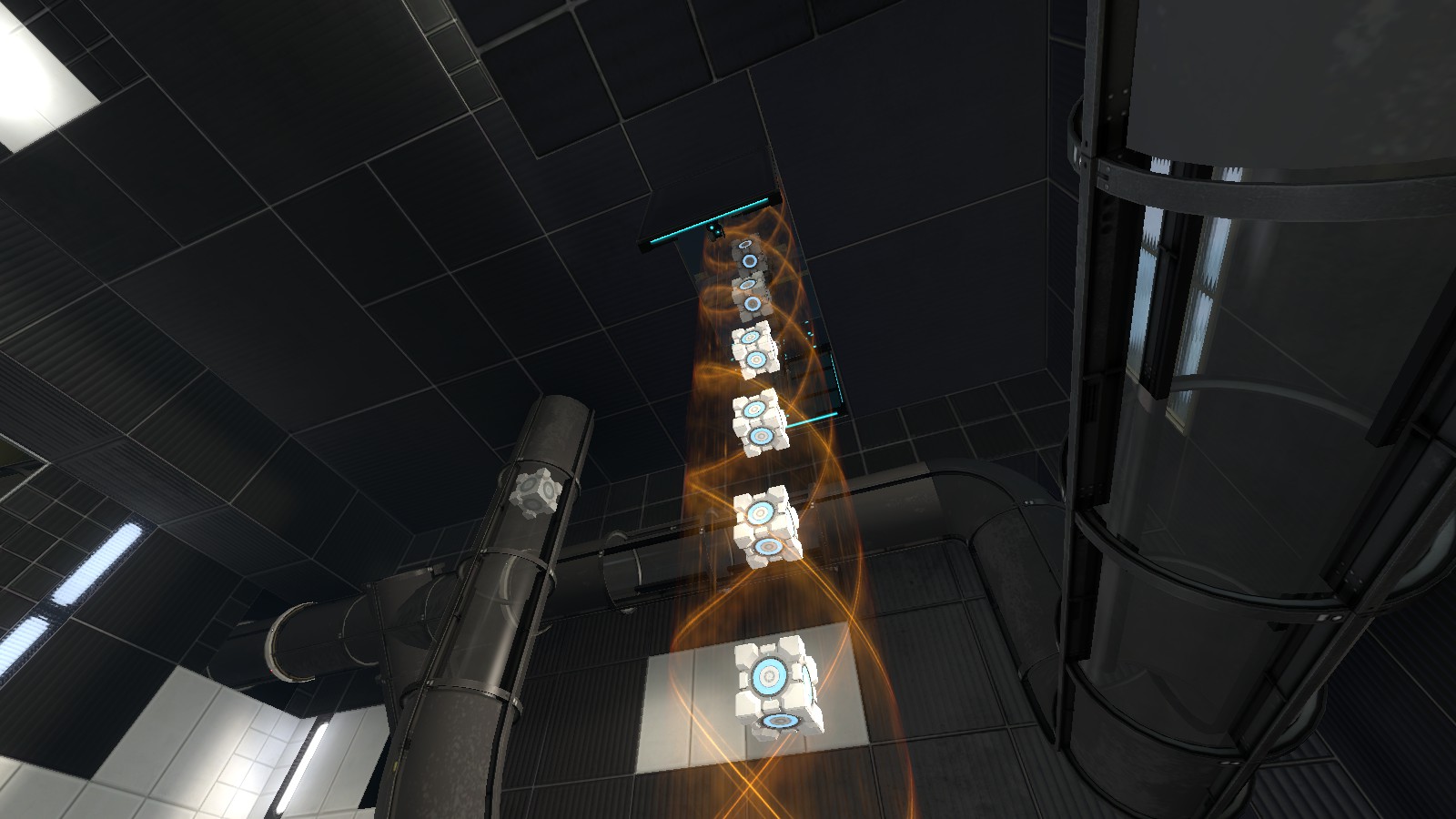
Being a young and ambitious level creating enthusiast without any restrictions holding me back, I wanted to use every cool looking model, effect, animation, you name it. So, I crammed in as many cool things as I possibly could within the confines of my level. This resulted in certain elements impacting gameplay. I will show you a couple of examples:

When you enter the 2nd area, a large moving chamber rolls past, blocking your view to the exit.

There is this catwalk that seems accessible by jumping to it, but in fact is blocked by an invisble wall and will lead to the player's death.

This tractor beam is usually just a gameplay element but in this case I figured I could use it as some decorative looking element that transports cubes in an alternative way (opposed to the usual transport tubes).
I've seen players play my level and clearly struggle with & misinterpret these cases. These are quite obviously negatively impacting gameplay, hence they should have been altered or removed.
In the first version of this map, it merely consisted out of the 2nd room where the real puzzle is. But, players seemed to struggle to find out what to do in this case. As the Pneumatic Diversity Vent (PDV) is a scrapped testing element, players had never experienced it. They had no idea how it works or what they could do with it. Hence, I created a room which contained the PDV, preceding the main puzzle.
Although it might seem minor, sound is incredibly important and should never be neglected. Now, I did pay attention to add some sounds here and there, but all in all it was rather lacking. For example, I had two music tracks playing at the same time by accident and had not noticed since I tested the map without music on.
Ambience was lacking too. Low humming and droning noises are absent. Sound didn't reflect the scale of the environment which broke immersion for the players.
One of the comments even mentioned the lack of attention for sound in my map. I have been advised to look into soundscapes next time I will create a map, which is feedback I take to heart.
There are some rather significant improvements still to be made. But as I mentioned before, this is the level that I learned the most from. And thus, I am still proud of how it turned out. And, looking at the overall response by the community, I have no reason not to be.